I may do some more tweaking, but it's very usable at present. I tried to use similar color schemes to the old Chase Lounge, since several users expressed a preference for that look.
For those who don't already know, you can switch to any of the available styles by scrolling to the bottom and selecting from the style drop down menu on the left. You can also make a "permanent" selection (one that lasts beyond the current session) of a style other than the default style via your user control panel. That way, whenever you login, regardless of the computer, your preferred style will be automatically selected.
I will do a poll shortly to see how many people are using each style. I'm curious if those currently using the "conventional" style like this new style better.
Re: New Style - Earth Tones - available.
2I like the color, Fly. But I notice (at least on my monitor) the screen widens so that I need to scroll from left to right, where I don't have that need in the default mode. Probably a setting that I admit I have not looked at myself. Just thought you might want to know.
Also, I notice a new graphic at the top with the earth tones skin that I don't see with the default. Is this on purpose or something overlooked? I like it and would love to see it always. Just curious.
DH
Also, I notice a new graphic at the top with the earth tones skin that I don't see with the default. Is this on purpose or something overlooked? I like it and would love to see it always. Just curious.
DH
"Leave the gun...take the cannoli." - Clemenza
Think Tony Died? Consider this...
Visit my Blog at Hear the Hurd
Think Tony Died? Consider this...
Visit my Blog at Hear the Hurd
Re: New Style - Earth Tones - available.
3Detective Hunt wrote:I like the color, Fly. But I notice (at least on my monitor) the screen widens so that I need to scroll from left to right, where I don't have that need in the default mode. Probably a setting that I admit I have not looked at myself. Just thought you might want to know.
Also, I notice a new graphic at the top with the earth tones skin that I don't see with the default. Is this on purpose or something overlooked? I like it and would love to see it always. Just curious.
DH
DH I think I know what's causing the scrolling. What resolution are you using on your video card/monitor?
Before refining that style, I researched to confirm the most popular screen resolutions. According to the sources I found, 1024X768 is the most popular resolution, so I set the width of the main table to 1024 -- a fixed width -- as opposed to the default and conventional skins, which adjust to whatever screen size you're using. I'm using a widescreen flat panel and many people use resolutions greater than 1024, so on those screens there's just extra space around the tables that hold the post and forum data. This is exactly what the "fusion x" style does, for example.
However if those interested in the Earth Tone skin are bound to using resolutions lower than 1024 wide, I can very easily alter the table to be, for example, 800 pixels wide. I can't imagine that too many people are using a resolution lower than 800x600.
The only reason I didn't make the table automatically adjust width to any screen size is that the graphic I made for the top is not uniform for any appreciable amount across the width. There's some 3D lighting effects, reflection maps, and rasterized 3D text involved, which make it impossible for me to simply adapt an existing css/html template, like the one for the default style, and tell it to repeat a small picture file many times in a row. The graphic at the top of Earth Tones is one continuous jpeg file that is 1024 pixels wide. This is not a particularly wise or popular way to construct a header (for bandwith and page load time reasons alone), but I'm giving it a try anyway.
I had really hoped to do a more elaborate and complete graphic for the header of the default style, more akin to what I did for Earth Tones, but I'm limited in that I don't know enough about code to do anything but replace the images in the original template with identically-sized images. I don't even know how to write code that will superimpose text over the middle section of the header, which is comprised of a single gif file about 1 pixel wide that is repeated over and over.
Whenever you get into a fixed width header, you then have to have a fixed width table for all the forum and post listings, which forces you to choose a single resolution for all users. That's what I did with the Earth Tones style, but I don't want to do that to the default style.
I just downloaded an html editor today, and I hope to find time in the next few weeks to learn a lot more about coding. One thing I want to do for sure is add some static html pages with keyword descriptive URLs to help with SEO for the site.
To accomplish this, I'm thinking of either a collection of portal pages to the various forum categories or perhaps just some select topical portals, each with a featured post that I will pull from the backlog here and leave in the spotlight for a few weeks at a time. For example, I might have a static URL portal page named the following:
www.thechaselounge.net/sopranos_individ ... orums.html
Then I'd pull one post from that forum group to spolight on the static page with links to the related forums (to all forums, in fact).
I want to bring the forum's visibility up on Google so that when the A&E reruns begin and the new season approaches, interested persons can actually find the place via search engine. There are very, very few relevant searches that will put this fourm anywhere near the top of a google search result. And the search queries most likely to be used (e.g., "sopranos forum") are not among them. I hope to rectify that so that it at least makes it to the 2nd or 3rd page.
Re: New Style - Earth Tones - available.
4DH, just following up about your screen resolution. Have you checked which one you're using?
Re: New Style - Earth Tones - available.
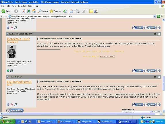
5Actually, I did and it was 1024X768 so not sure why I got that overlap. But I have grown accustomed to the default by now anyway, so it's no big thing. Thanks for following up.
"Leave the gun...take the cannoli." - Clemenza
Think Tony Died? Consider this...
Visit my Blog at Hear the Hurd
Think Tony Died? Consider this...
Visit my Blog at Hear the Hurd
Re: New Style - Earth Tones - available.
6DH, I narrowed the table by 12 pixels just in case there was some border setting that was adding to the overall width. I'm curious to know whether you still get the scrollbar now on the bottom.
If you do still see it, would it be too much trouble for you to email me a compressed screen capture, just so I can see what's going on? With a widescreen LCD, I can now only view effectively at one resolution and not in a 4:3 aspect ratio.
If you do still see it, would it be too much trouble for you to email me a compressed screen capture, just so I can see what's going on? With a widescreen LCD, I can now only view effectively at one resolution and not in a 4:3 aspect ratio.
Re: New Style - Earth Tones - available.
7Yeah, I still show some overlap. I've got a screencap I can send you once I get home from work.
"Leave the gun...take the cannoli." - Clemenza
Think Tony Died? Consider this...
Visit my Blog at Hear the Hurd
Think Tony Died? Consider this...
Visit my Blog at Hear the Hurd
Re: New Style - Earth Tones - available.
8Fly, I am including a screencap (though not very good, I am afraid) for how my screen looks with the Earth Tones look:
 If this does not help you, PM me your email address and I'll send you a better one.

"Leave the gun...take the cannoli." - Clemenza
Think Tony Died? Consider this...
Visit my Blog at Hear the Hurd
Think Tony Died? Consider this...
Visit my Blog at Hear the Hurd
Re: New Style - Earth Tones - available.
9DH, thanks for that capture. I'm really just guessing at what parameter in the CSS templates is going to change this thing. I just edited it again to make the table 40 pixels narrower than it was originally. Can you try the skin again and tell me whether it looks like there is more, less, or the same amount of scrollbar as there was to begin with? You don't need to post another capture, just estimate whether it's discernably better or unchanged.
If fiddling with table width helps some, I'll just need to keep narrowing it until I find the sweet spot.
Was struck right off that your screen cap colors are radically different than the colors of the live page on my monitor. Color matching is hard enough in the video world with calibrated monitors and SMPTE bars. I'm about ready to conclude that it's impossible with computer screens.
Re: New Style - Earth Tones - available.
10It looks good now, Fly. No rollover.
As for color, it jumped a bit from its original color when I saved from a print screen to a jpg in Paint. Just a crude screencap to show you the layout. The actual color of the earth tones are much closer to the old Chase Lounge colors.
As for color, it jumped a bit from its original color when I saved from a print screen to a jpg in Paint. Just a crude screencap to show you the layout. The actual color of the earth tones are much closer to the old Chase Lounge colors.
"Leave the gun...take the cannoli." - Clemenza
Think Tony Died? Consider this...
Visit my Blog at Hear the Hurd
Think Tony Died? Consider this...
Visit my Blog at Hear the Hurd
